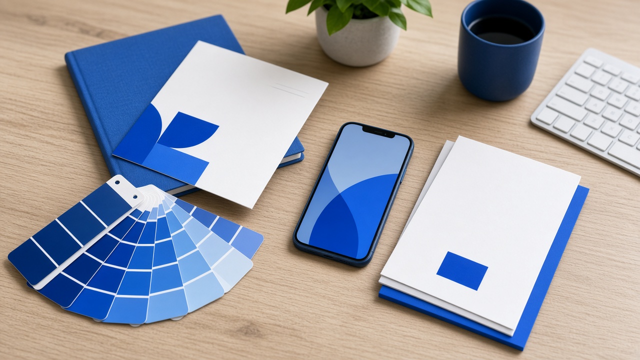
Visual identity is not an 80-page manual. It is the ability of a stranger, moving from a post to an email and from an email to a card, not to wonder whether they are still speaking with the same company. Color, type, the crop of the portrait and the tone of the job title are signals of continuity. When they fail, the customer does not say “brand inconsistency.” They say “this does not add up” and they do not reply.
What consistency means in practice
Consistency is not repeating the same banner everywhere. It is a short set of decisions that are not renegotiated by channel: a palette, a pair of typefaces, a way to crop the portrait, a way to write the title and a logo that is not stretched. Each channel has constraints — the LinkedIn avatar is not the website cover — but the decisions travel. What does not travel is a “social style” invented on Friday and a “corporate style” on Monday.
Nor is consistency cloning the slogan on the signature, the QR and the bio. It is the company name, the person name and the canonical link being the same. A surprising share of visual damage is not color: it is the phone number that changes, the title that does not match and a six-year-old photo next to this quarter’s.
Where it actually breaks
- The email signature with a pixelated logo, an old title and a link to a home page that is not the campaign’s.
- The personal profile on LinkedIn — the one with more engagement, ~3.85% versus ~2.10% for the page — with a photo and a headline that do not exist on the card you send.
- The QR generated in a color that loses contrast, or with a template frame that is not the brand’s.
- The contact card with a different template per salesperson, as if each one were an improvised franchise.
Those edges are exactly what the buyer sees when they decide whether to write. 73.3% prefer messaging and 87% of B2B marketers work on LinkedIn: identity is judged on small screens, not in the brand presentation that lives in an internal PDF.
The cost of fragmentation
A broken visual system makes every touch more expensive. The team remakes assets. The salesperson sends “their” version. The customer saves three numbers. The recognition you thought you had bought with a redesign evaporates in the first thread. On an omnichannel path — where LinkedIn, WhatsApp and email together reply at 10–16% versus 1–3% for email alone — incoherence is more visible, because the buyer crosses channels in days, not months.
There is a worse internal cost: nobody knows which version is current. If the “official” logo lives in five folders, consistency is a wish. You need a source — color, logo, type, portrait, title, URL — and a rule not to improvise a variant “for this channel.”
A short system you can actually run
Five pieces are enough if they are kept: palette, type, portrait, logo lockup and canonical link. Everything else — story templates, video-call backgrounds, QR frames — is derived. If a new piece cannot be built from those five, it does not ship. That rule is more useful than a brand book nobody opens.
The digital card, the QR and the signature are brand surfaces, not extras. BlimxCard groups those three so the contact receives the same identity on every channel: the same data, the same link, the same visual standard.